There is a world of enthusiasts out there who will discuss the most obscure details of their chosen interest at great length.
Before you nod in agreement, I’m talking about font designers, of course. Us font designers will be able to identify which cut of Akzidenz that book cover happens to be set in, or the specific weight of Gill that sign uses at ten paces or more. We will share obscure typeface catalogues, or take great care to research and digitally revive forgotten gems. It’s a curse – I sometimes find myself looking at the letters instead of reading what they actually say. I’m like the special effects guy who sits through a film analysing the green-screen work.
These enthusiasts know when something is wrong – from an anachronistic use of Arial in a film set 50 years in the past, to a hand-painted sign that looks nothing of the sort. Nowadays, these gaffes are quick to be posted online where a freeze-frame and a screen grab are all you need to out the mistake.
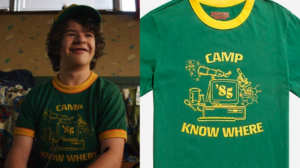
My own font Rogue Sans Nova, designed in 2004, was recently used in Stranger Things. Now, Stranger Things is set in 1985, so I’m looking forward to the twist in some future episode where Dustin is sent forward in time, knocks on my studio door, and I show him what I’m working on.
Font design crosses over with science fiction in so many ways. I wonder how many future graphic designers were enthralled by the livery on the side of Thunderbird 2, or the user interface of a Star Trek console. The models in the Gerry Anderson series were built to several different scales, and decorated with rub-down Letraset transfers, the go-to lettering technology of the day. As these sheets of Letraset only came in certain sizes, the proportions of the type on the model could change shot to shot – look carefully at the opening title sequence, and you’ll see that the ‘1’ on Thunderbird 1 changes mid-way in the crash zoom.
The numbers on the Thunderbird craft, and on the pod doors, are in Futura, Paul Renner’s classic early moderne sans serif from 1927. The ‘Thunderbird’ name is set in Stephenson Blake’s ‘Grotesque’ series, usually Grotesque 5. Stephenson Blake was a venerable Sheffield hot-metal foundry whose typefaces were later adapted to rub-down and now digital technology.

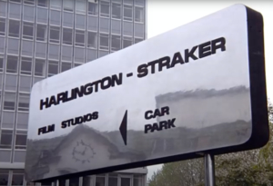
But the go-to typeface that came to epitomise the 1960s and 1970s vision of tomorrow was Allesandro Butti’s Microgramma. Originally designed for the stylish Italian type foundry Nebiolo in 1952, it had an ‘o’ that was shaped like a TV screen, and that fact placed it at the cutting edge of new technology. Stanley Kubrick used it in 2001: A Space Odyssey, and (probably because it was also available in Letraset) so did Gerry Anderson, in the titles of, and on the sides of the vehicles in his first live-action show UFO: the SHADO mobiles, Skydiver, and the Harlington Straker studio sign. SHADO (Supreme Headquarters Alien Defence Organisation) had its own nifty logo, a silhouette of a figure, also sporting Microgramma. If you’re heading up a secret organisation a prominent logo probably isn’t a good idea, but I thought it was a great design and decided that creating logos for a job might be something I should look into.
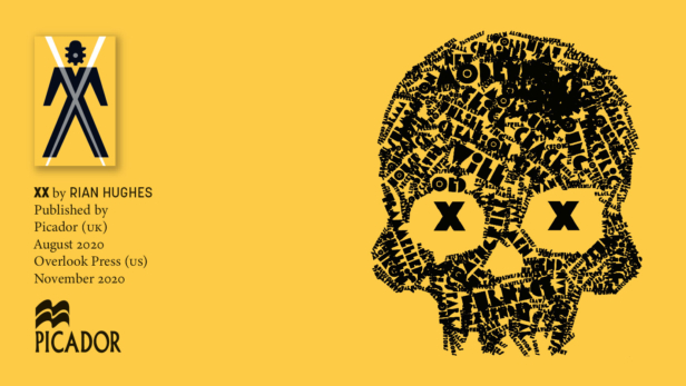
A few decades later, and I’m parlaying this fascination with the excessive power of typography into my own science fiction novel. If words have power, the fonts those words are set in add another layer – the ‘tone of voice’, if you like. ‘XX’, My ‘novel, graphic’ pushes this to the limit – I revisit Microgramma, and add several fonts of my own design to push the plot forwards. Why should novels be set in a ubiquitous typeface like Times New Roman when we have the expressive range of tens of thousands of other alternatives out there to play with? Design and type have power – get the old toys out, and see what they can teach you.
‘XX’ is out now in the UK from Picador, and in November from Overlook Press in the US.
Rian’s logos for comics, music and more are collected in ‘Logo-A-Gogo’, Korero Press, and his fonts in ‘Typodiscography’.